Modemetrix is a SaaS-style admin platform for managing vendor registration, document uploads, key-value annotation, bulk uploads, archives, users, and notifications through a simple dashboard experience.
The platform needed to make repetitive vendor and document tasks easier to manage. I focused on a calm sidebar structure, readable tables, clear status states, and simple action areas so users can move through operational tasks without confusion.
The main goal was to create a dashboard that feels approachable while still supporting structured workflows such as registration, sample document upload, annotation, bulk uploads, and archive management.
Group related tasks inside a clear sidebar so users can quickly understand where each workflow lives.
Use spacious tables, status pills, and consistent actions to make operational data easier to review.
Keep forms and task screens clean so users can complete vendor/document workflows without visual overload.
The case study now highlights selected interface moments: navigation, vendor tables, annotation workflows, document uploads, and user management. This makes the project easier to review and more portfolio-friendly.
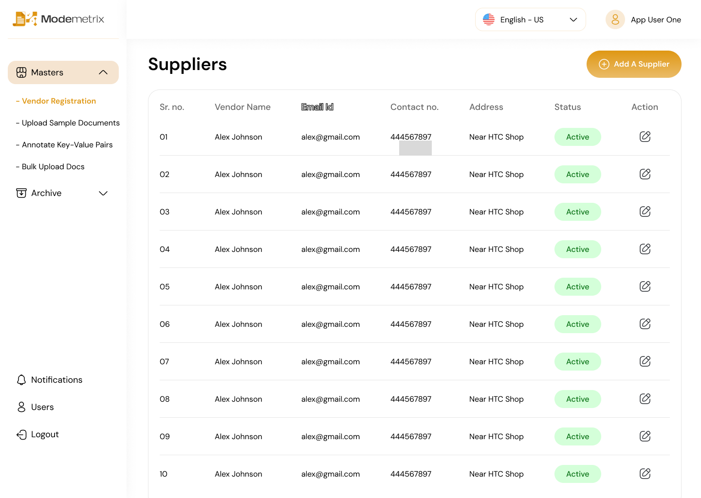
The supplier table uses generous spacing, simple columns, green status labels, and a primary action button so the page feels practical and easy to scan.

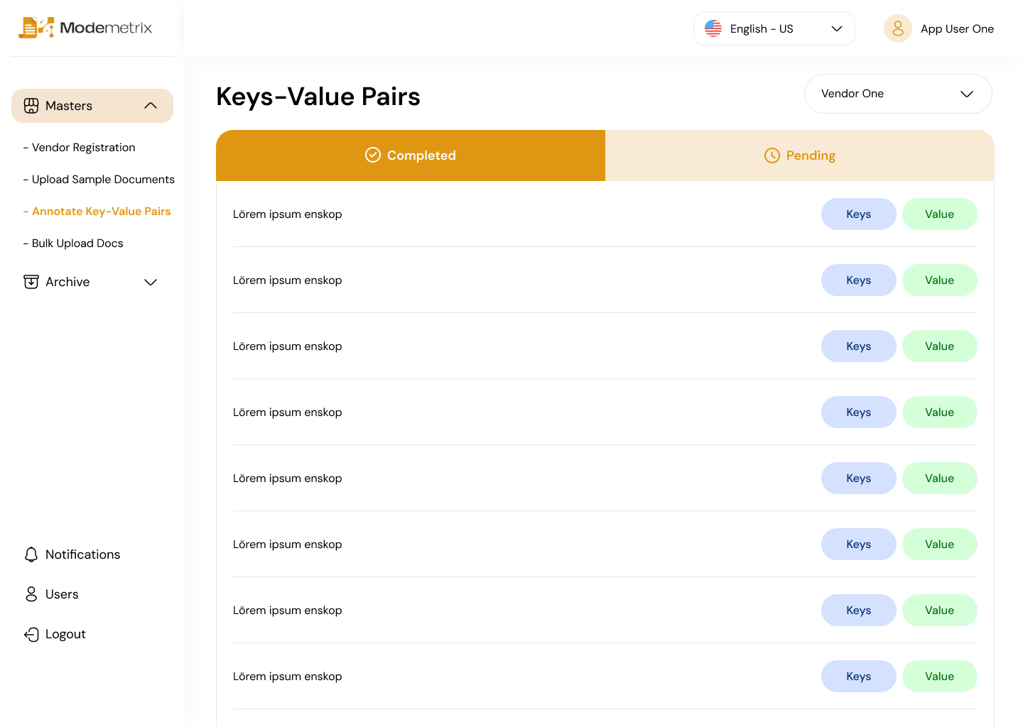
The completed and pending tabs create an immediate sense of progress, while repeated row actions keep the annotation task predictable.

Instead of showing full pages inside a scrollable image, each screen is presented as a clean card so the viewer can quickly understand the interface range.

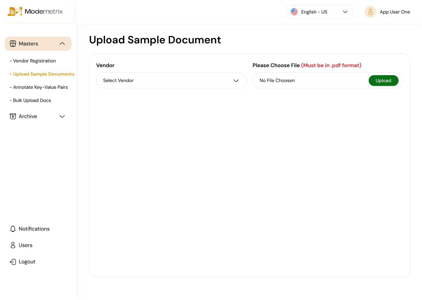
A clean upload-focused screen for adding and managing sample documents.

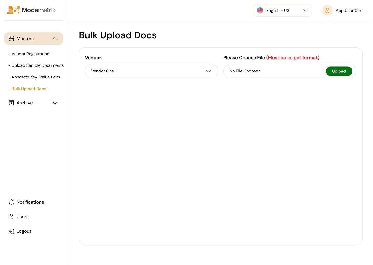
A workflow screen designed for handling larger document batches.

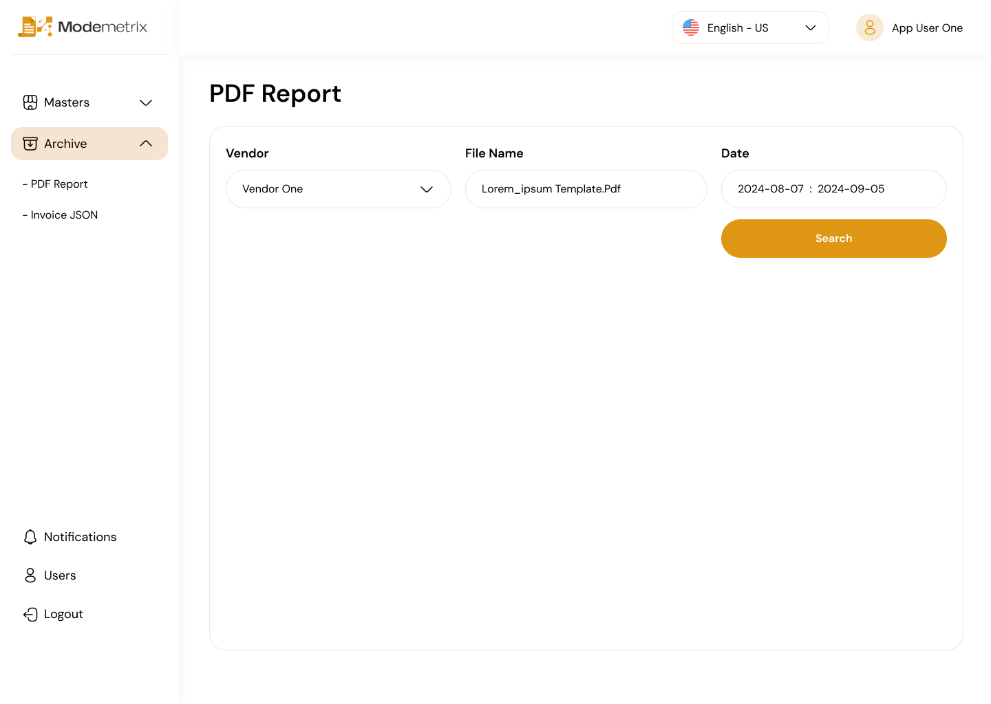
Archived records are separated into their own area for cleaner long-term management.

User management stays consistent with the same table and action system.
The visual direction stays clean and low-distraction because dashboards are used repeatedly. The design prioritizes speed, clarity, and confidence over decorative complexity.
Primary areas stay visible while nested items help organize deeper vendor-related workflows.
Rounded status pills make record states easy to identify without adding visual noise.
Buttons, edit icons, tables, and filters follow a repeated pattern so users do not need to relearn each screen.
This project shows my ability to design structured product interfaces, organize admin workflows, create reusable screen patterns, and present dense information in a cleaner, more usable way.